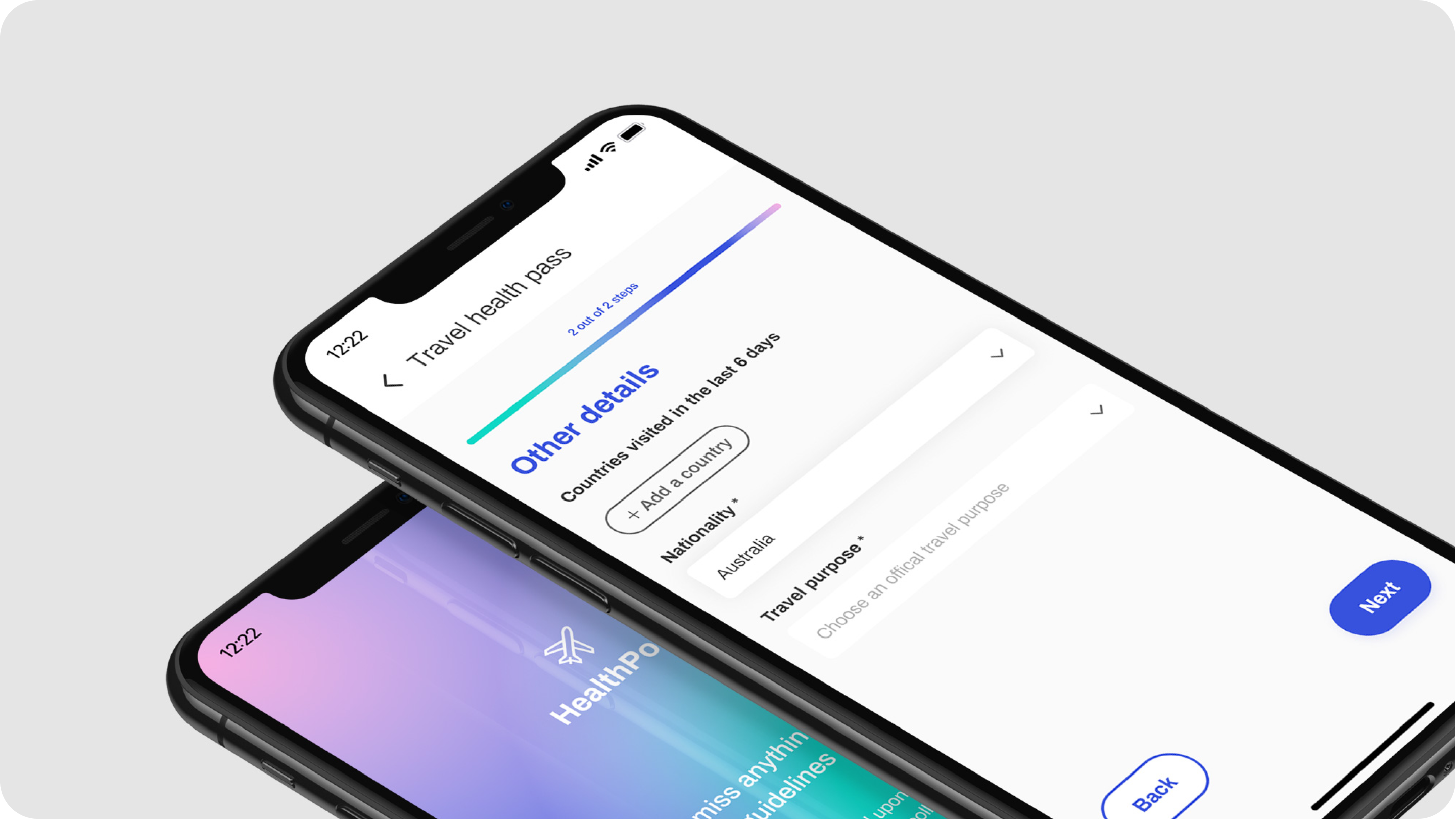
We chose the topic since we believed that if health passes are designed holistically and with the user in mind, they could empower people to start traveling again. Having designed a customized, rapid UX/UI process, we created our very own health passport concept - HealthPort.
The current state of the health passports market and future predictions
Digital health passports are a hot topic at the moment. Many companies are currently working on their versions of health (or vaccination) passports, including tech giants such as IBM, Microsoft, Oracle, and Salesforce and smaller tech firms i.e. the VST Enterprises. Even non-profits like The Commons Project and travel associations – The International Air Transport Association (IATA) are on board.
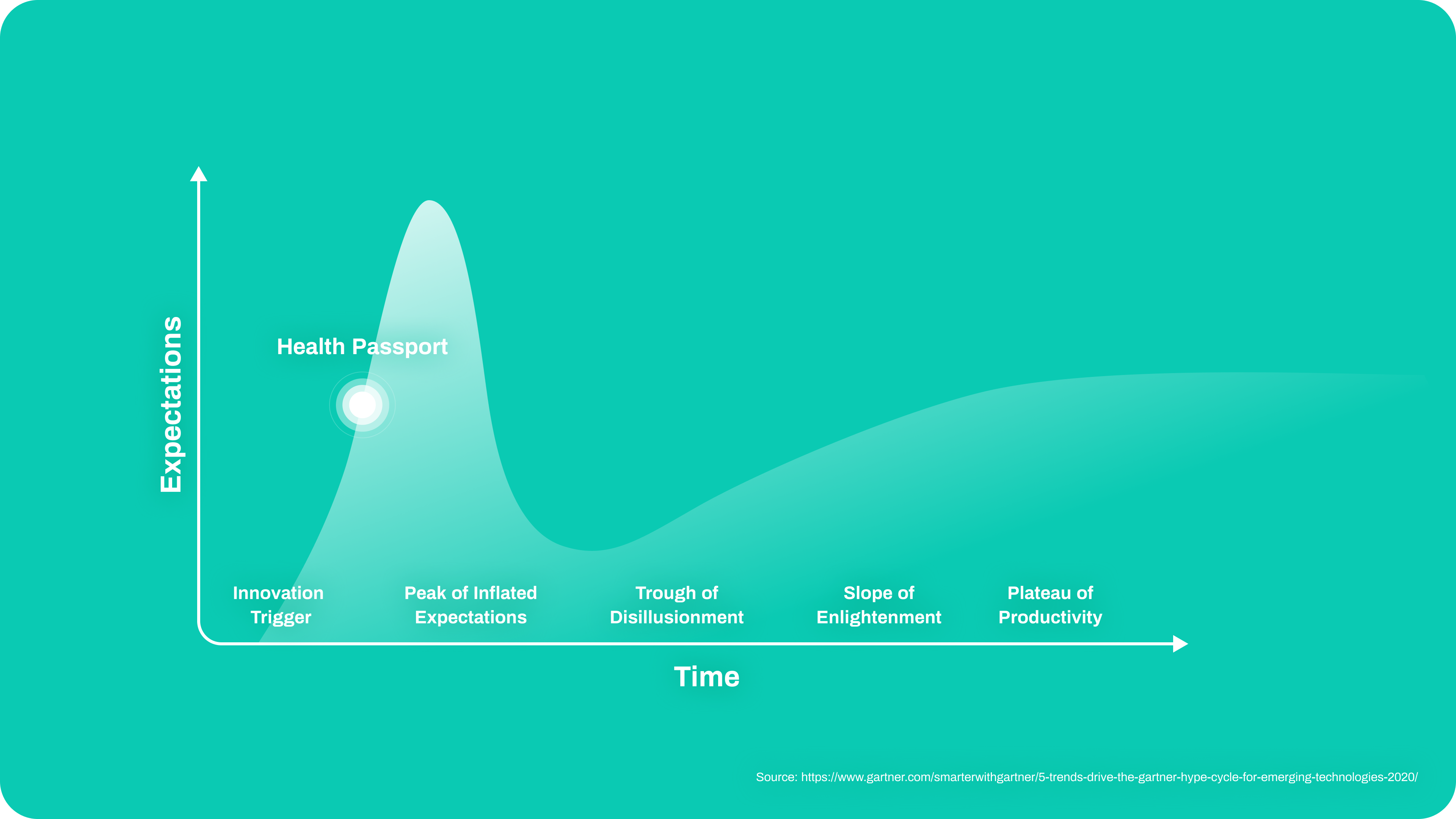
What is more, trends predictions show that this boom will continue in the upcoming years. Gartner’s Hype Cycle for Emerging Technologies predicts that within the next two years real-world benefits of health passports will have been demonstrated and accepted, and a sharp rise in the adoption of digital passes will begin (see the graph below).
Our process
Why did we think that we can add something to what’s been done by digital pros at IBM, Microsoft, etc.?
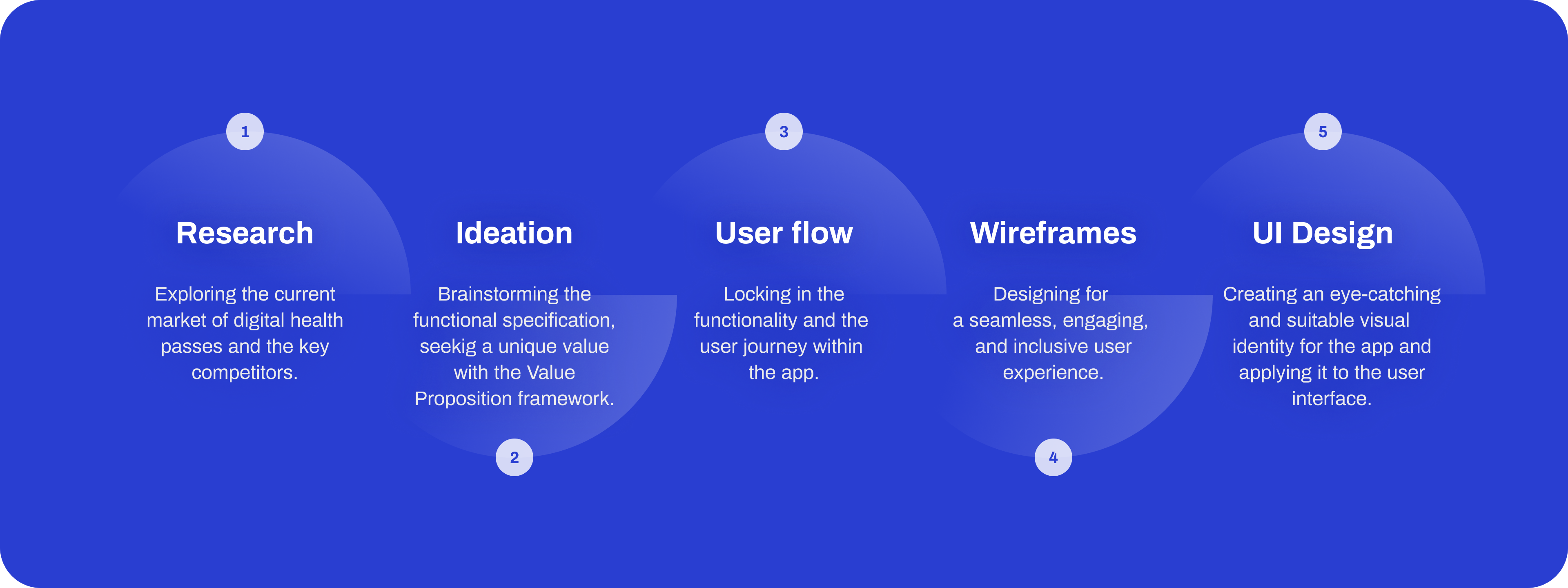
To be truthful – we didn’t know whether we could, not without an in-depth market analysis and some collaborative brainstorming. That is why we adopted the following process:
- Desk research - Here, we explored the current market of digital health passes. We also carefully analyzed the offerings of all key competitors.
- Ideation – Based on research findings, we brainstormed what featured we could provide and what the flow could roughly look like. We also used the Value Proposition framework to explore the unique selling point of our concept.
- User flow - Here, we simply finalized the functional specification and user flow. We also established which parts of the user journey we would design.
- Wireframes – We turned the user flow into wireframes to create a seamless, engaging, and inclusive user experience. Of course, this was just a most likely failed attempt at being inclusive as there are huge limitations of designing without engaging users with diverse backgrounds and demographics. However, we did make a conscious effort not to exclude gen X users by i.e, placing informative micro-copy in all places they might feel lost, using 14px+ bold fonts for all primary information, and making all interactive elements bigger than 30x30px.
- UI Design - Our visual designer first explored the visual identity of the app by creating a few different mood boards. She then experimented with a visual concept of the app, created a mini style guide, and, finally, turned the wireframes into beautiful and neat designs.
Unique Value Proposition
There are a few aspects of our concept that (as far as we know) are unique:
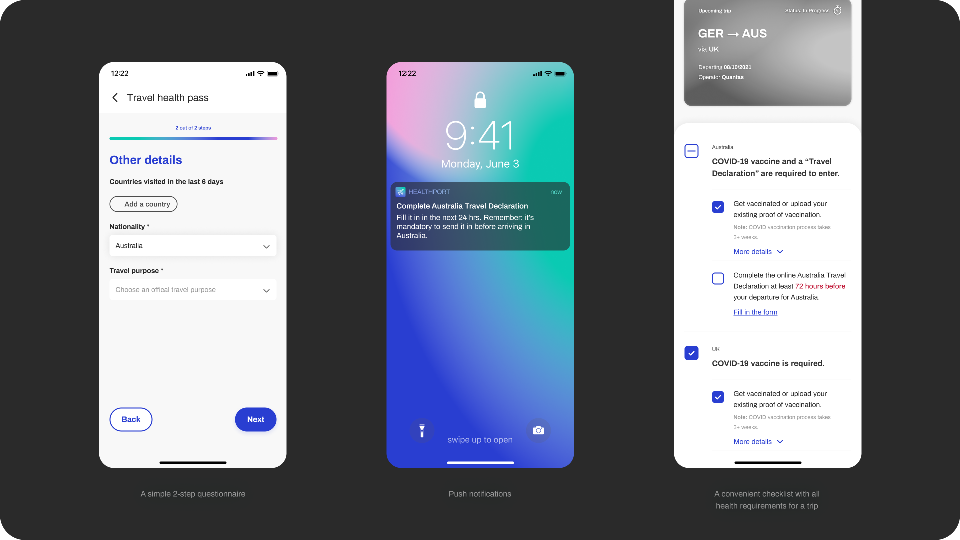
- A simple 2-step questionnaire that allows all users to check health requirements for their trip. No sign-up and bo boarding pass required.
- Notifications! The application sends users push notifications to:
- Notify them about changes to health requirements they checked.
- Remind them about steps that they are yet to complete i.e., it will send them a notification 24hrs before the deadline for sending in a health declaration (available to registered users only).
- A convenient checklist with all health requirements for a trip. The checklist system:
- Evaluates elements of the list against the credentials the user already has stored in their digital health passports (available to registered users only).
- Enables the user to track progress. Whenever they complete a requirement, it’ll be checked off the list (available to registered users only).
Our concept
Aside from the USPs, there are a few other HealthPorts features worth mentioning:
- Explanatory 3-step wizard – When a novice user first opens the app, they find the three core features of the app briefly explained. We designed it that way because we believe that it’s important to give the user a clear idea of what to expect.
- Simple & secure deferred sign-up – If the user wants to make use of all the HealthPort’s features, they need to set up an account. The 5-step sign up is intuitive and accessible. It includes: creating an account with an email & a strong password, verifying the account, providing a full given name, scanning proof of ID, and a face scan.
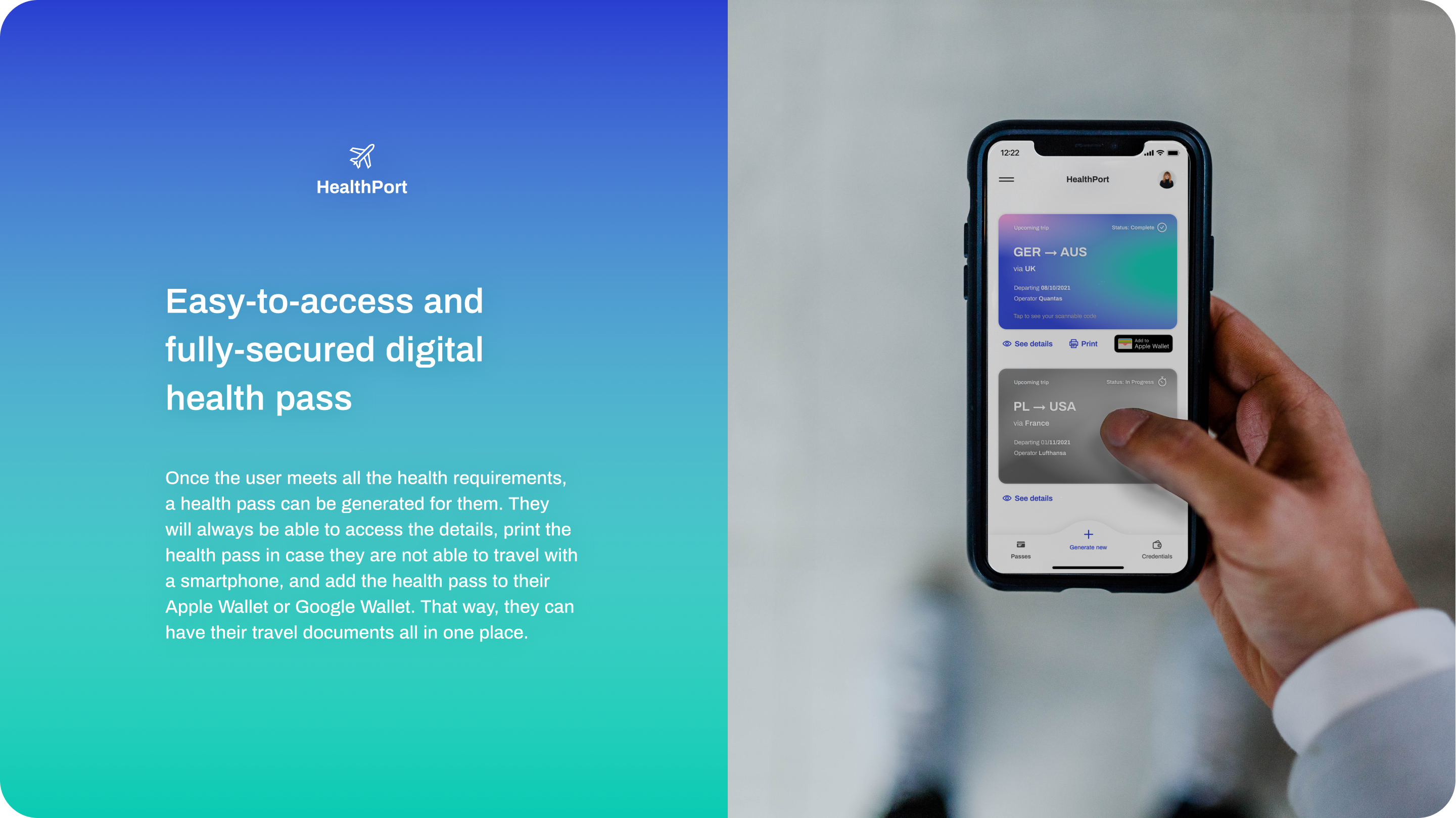
- Super functional, safe digital health passes – Once the user meets all the health requirements, a health pass can be generated for them. They will always be able to access the details, print the health pass in case they are not able to travel with a smartphone, and add the health pass to their Apple Wallet or Google Wallet. That way, they can have their travel documents all in one place.
Other considerations
Although we haven’t designed a system architecture for HealthPort as such, we’ve made a few technical considerations for the system. Most importantly:
- The application would not use QR codes due to the risks they pose for the users. Instead, it would use a safer alternative of scannable codes with end-to-end encryption i.e. VCode®.
- At first, the application would partner with as few parties as possible. For us, a large number of dependencies is a significant drawback of a few of the existing concepts. These brands risk that their app will be unusable unless all parties participate. To avoid that, we thought HealthPort should start small, and scale up once it has a significant user base.
- At the start, we will only need vaccination centers to partner with HealthPort and provide the app with reliable information. Unfortunately, there is no workaround here, we cannot have users providing self-declared, unverifiable medical data.
- We did, however, find a workaround for engaging local authorities and asking them to enter health requirements to HealthPort. We could use an existing, well-tested system such as Timatic. Timatic Solutions is a platform that allows users to verify their travel documents and check health requirements and can be integrated into other systems. HealthPort can get reliable, up-to-date health requirements from there.

Summary / Takeaway
To sum it up, our rapid process of creating a UX/UI concept definitely has its limitations and we would have loved to engage a diverse group of users in the process. Nevertheless, we think that our concept, HealthPort is:
- Unique. Although there are a few health passport prototypes on the market, HealthPort offers three unique features.
- User-friendly. HealthPort’s uniqueness lies in being valuable and convenient. We believe that features such as notifications and progress tracking could be game-changing. HealthPort also adopts some popular design patterns i.e., deferred onboarding. These should make the experience better for the users and more profitable for the brand.
- Aesthetically pleasing. HealthPort stands out by its visual identity as well. Its branding is highly professional and uplifting at the same time.
- Safe. Thanks to no self-declared medical data and no QR codes.
- Scalable. HealthPort is a simple app with few dependencies and a lot of room for growth.
We’re also convinced that if a user-centered, inclusive approach is applied to further development of health passports, they will empower people to start traveling again. The ‘new normal’ is a challenging time that makes people feel stressed and uncertain a lot of the time. We see it is our duty as digital designers to make that shift easier for fellow humans. Do you?
